Senior Voices PDX eagle emblemSenior Voices PDXTeam reference · Development

Version 1.1 · 2026-11-03

Senior Voices PDX
Brand style guide

The current Senior Voices PDX identity, gathered for the team. This reference records the existing development site; it does not introduce a new visual identity.

Download PDF

View the PDF style guide →

01 / Identity

The marks to use

Square with wordmark

Main logo

Square with wordmark

Emblem above the wordmark and GEM line, centered in a square. For social, signage and square materials.

Transparent PNG · 2372 × 1779; SVG with outlined Poppins lettering

Unchanged official emblem, Poppins lettering, public-site navy and brand gold. Transparent background for white or pale surfaces.
Horizontal with wordmark

Main logo

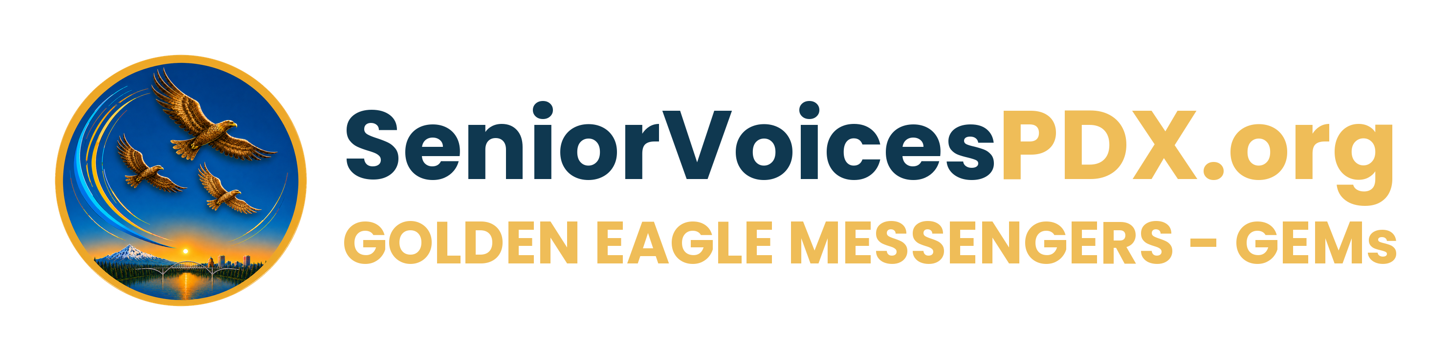
Horizontal with wordmark

Emblem on the left, wordmark and GEM line on the right. For letterheads, banners and wide materials.

Transparent PNG · 2966 × 740; SVG with outlined Poppins lettering

Unchanged official emblem, Poppins lettering, public-site navy and brand gold. Transparent background for white or pale surfaces.
Emblem only · square

Main logo · official emblem

Emblem only · square

Primary organization mark. Used in the shared header, footer, name cards, and press kit.

Transparent PNG · 1181 × 1239 · trimmed copy of the original emblem

src/app/brand.ts · CURRENT_LOGO; Press Kit labels this the official emblem.
Wordmark only

Main logo

Wordmark only

Wordmark and GEM line without the emblem, for tight horizontal spaces where the emblem appears nearby.

Transparent PNG · 2372 × 554; SVG with outlined Poppins lettering

Poppins lettering in public-site navy and brand gold. Transparent background for white or pale surfaces.

01b / Identity

Dark logos

For black or very dark surfaces. "SeniorVoices" switches to Honey; PDX.org and the GEM line use Beacon, the same gold as the light logos.

02 / Color

Our existing palette

The site has two existing layers: saved site-style defaults and public-page overrides. Both are documented below instead of silently choosing one. These are screen RGB colors; no approved CMYK or Pantone specification was found.

Color table

SwatchNameHEXRGBWhere it's used
 Harbor#0F385015, 56, 80Site header and footer
 Beacon#EFBD58239, 189, 88Event marks and navy message bands
 Eagle#E6BC59230, 188, 89Primary brand gold accent
 Honey#FFF4CF255, 244, 207Soft gold page and section backgrounds
 White#FFFFFF255, 255, 255Main page background; text on navy
 Ink#082F3A8, 47, 58Body text; hero background
 Forest#365D4854, 93, 72Primary buttons and highlights
 Parchment#F5EEDF245, 238, 223Warm alternate page background
 Wheat#F4CF86244, 207, 134Name-card and illustration accents
 Amber#D69000214, 144, 0Logo gold (PDX.org, GEM line); name cards
 Cream#FFFAF0255, 250, 240Name-card faces and soft panels
 Sky#57BEFC87, 190, 252Supporting sky-blue accent

Harbor

#0F3850
RGB 15, 56, 80

Shared header and footer; Power of Connection Events badge.

src/styles.css · shared header/footer override

Beacon

#EFBD58
RGB 239, 189, 88

Logo PDX.org and GEM line; Power of Connection Events mark and title; homepage navy message band.

src/styles.css · focus-hero-logo / h2-alone

Eagle

#E6BC59
RGB 230, 188, 89

BRAND_GOLD; saved style accent and GEM header wording.

src/app/site-style.ts · BRAND_GOLD

Honey

#FFF4CF
RGB 255, 244, 207

Homepage AARP spotlight and Partnerships page background.

src/styles.css · h2-aarp / partner-ecosystem

White

#FFFFFF
RGB 255, 255, 255

Homepage background, surface default, light text on navy.

src/styles.css / src/app/site-style.ts

Ink

#082F3A
RGB 8, 47, 58

Default text and header token; public header currently overrides this with navy.

src/app/site-style.ts · palette.ink

Forest

#365D48
RGB 54, 93, 72

Default primary role in the existing editable site-style system.

src/app/site-style.ts · palette.primary

Parchment

#F5EEDF
RGB 245, 238, 223

Default page background token; homepage currently overrides this with white.

src/app/site-style.ts · palette.background

Wheat

#F4CF86
RGB 244, 207, 134

Existing name-card and supporting illustration accents.

src/styles.css · --gold-light; name-card designs

Amber

#D69000
RGB 214, 144, 0

Existing main name-card accent; not a replacement for protected brand gold.

src/app/aerie/CardDesign.ts / CardVariations.tsx

Cream

#FFFAF0
RGB 255, 250, 240

Existing main name-card face and supporting directory surfaces.

src/app/aerie/CardDesign.ts / src/styles.css

Sky

#57BEFC
RGB 87, 190, 252

Current alternate-card sky token, oklch(0.767 0.13 238), converted to 8-bit sRGB. Supporting accent, not a core site-color replacement.

src/styles.css · --name-card-sky; CardVariations.tsx


03 / Typography

Poppins, throughout

Poppins is the existing site standard for headings, body copy, the GEM wording, and every name-card face. Root font loading also includes Work Sans, but it is not the current configured brand family. Old Georgia/Arial rules and the Font Lab's alternatives are not new official typefaces.

Fallback: Arial, sans-serif. Get Poppins & license information

Large section heading

64px / weight 400 / line-height 1.08 at 1280px; responsive on the existing site.

Homepage · Six ways heading

Wisdom meets action

Featured-focus heading

38.4px / weight 400 at 1280px; existing heading changes with viewport width.

Homepage · Featured Focus Area

Power of Connection Events

Brand name

25.6px / weight 700 at 1280px; PDX.org uses protected gold.

Shared homepage header

SeniorVoicesPDX.org

Homepage lead

18px / weight 300 / line-height 20px; Poppins throughout.

Homepage lead paragraph

Golden Eagle Messengers empowering seniors and neighbors of all ages

Supporting site text

Existing public sections commonly use 20px body text; weights vary by section. Use readable contrast, not gold text on white.

Public-page styles

Resources, stories, and real connections.

04 / Everyday use

Keep it clear and consistent

Keep the source intact

Use the original transparent emblem download. Keep its square aspect ratio and all eagle details; do not stretch, crop, recolor, or add filters.

Use existing placements as examples

At a 1280px viewport, the footer emblem is 130 × 130px. These describe existing placements, not an approved universal minimum size.

Give the logo room

The press kit asks for clear space around the official emblem. Keep neighboring text outside its bounds and retain the spacing of existing header/footer lockups. No numeric clear-space formula or print minimum has been approved.

Choose a legible background

The primary emblem is already used on navy in the header/footer and on pale name-card faces. Use these demonstrated pairings and avoid placing a standalone mark over busy imagery without the existing badge treatment.

Keep experiments separate

Logo Lab, logo-variation, logo-concept, logo-riff, and logo-study files are not interchangeable official marks. The older gallery labels one study Preferred; that does not supersede CURRENT_LOGO.

Build accessible team material

Navy text on white or pale gold, and white or gold on navy, are existing useful pairings. Gold on white is not suitable for small body text. Never enlarge space-constrained button text on hover.

Quick team examples

  • Organization material: Use the official eagle emblem with the SeniorVoicesPDX.org wording in Poppins. Preserve the original emblem transparency.
  • Names and contact cards: Use Poppins on both faces. Existing main designs use navy, card gold, and cream; keep contact details and the six topic titles readable.

05 / Provenance

Sources & open brand questions

Not yet established

  • Confirm whether the saved-style green/ink/background should remain separate from the public navy/gold overrides. This guide records both; it does not harmonize them.
  • No monochrome/reversed eagle master, CMYK/Pantone palette, numeric clear-space formula, or universal minimum logo size was found.
  • Older galleries contain Preferred and study labels. Any future change to the official emblem needs explicit approval; those files are preserved but excluded from official downloads.

This reference and its PDF share the same brand record, version 1.1, dated 2026-11-03. Browser-only design drafts are not included.